Alternately Titled: In Where Erin Finally Chooses Her Grant Winner.
OK, so many of you asked that I fill you in on my “judging process” for our Society6 Grant winner, and the truth is, I don’t have one. But I did follow a bit of criteria, which is as follows:
1. If you’re my friend, you’re disqualified. I know, it’s mean, but it’s for the same reason my mother never let me attend the same elementary school she taught at. Favoritism, nepotism, and all of that. So if you’re not in this list, it’s either b/c (a) we’re friends, or (b) your work wasn’t good. Ha! Kidding! All the work was good. Fabulous, even.
And really, that’s my only criteria. At Design for Mankind, anything goes. That’s why you love it here!
So. This will be the only post today, b/c it’s going to be chocked full of inspiring work and people and you’ll have to take a break halfway because it’s just THAT good. So make yourself a tea, spritzer or whatever you drink, b/c you’ll need it. And get a comfy chair. And don’t drink too much b/c you may have to pee in the middle and you’ll miss something good. Deal?
Here we go… the top 15 finalists [and our winner, which you’ll meet soon enough!] for Design for Mankind’s FIRST EVER Society6 grant:
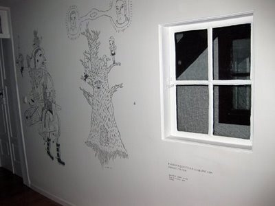
Rui was a finalist because of this mural, as it showcased that this guy has some serious range. I’m always a fan of mixing mediums, and if you’re normally a sketchbook paper artist, mix it up and challenge yourself. Try a wall, mural or ceiling fan. Anything works. But do it — stretch yourself. Rui did that, and it turned out to be a fantastic mural which gained him a spot in our finalist selection.
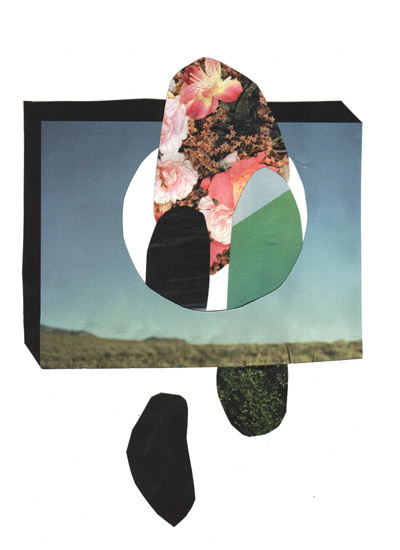
This piece did it for me. It only took one, although the various projects at KlubbClub are a plenty, and are all fantastic. But this piece? It exudes perfection for me. I’ve been very much into collage lately and this embodies a creative mixed media piece to the max.
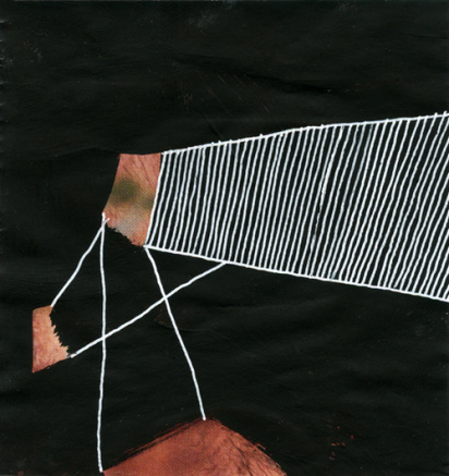
Shannon’s work doesn’t look like everyone else’s. She mixes old, dead guys with geometrics and makes them fresh and new. Fresh as water, which I suppose is why her last name is Freshwater. Anyway, this series earned her a spot in our finalist countdown, because it’s amazing to me.
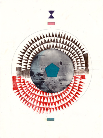
Jesse’s work screeeeams emerging to me. Everything in his portfolio is top-notch, and there’s a lot of it. I particularly loved this collaboration with Justin James Sehorn, as I’ve been very drawn to map coordinates, compasses and axis lately. Trend alert, perhaps?
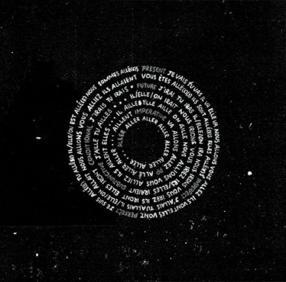
Oh snap. I broke my first rule. Although not really, because I’ve never met Carolyn in person, so she doesn’t count. This series earned her a spot, because it’s so different from her other work that for a second, I thought she could possibly be a different Carolyn Alexander than one I’d previously heard of. That shows serious range, which shows serious awesomeness.
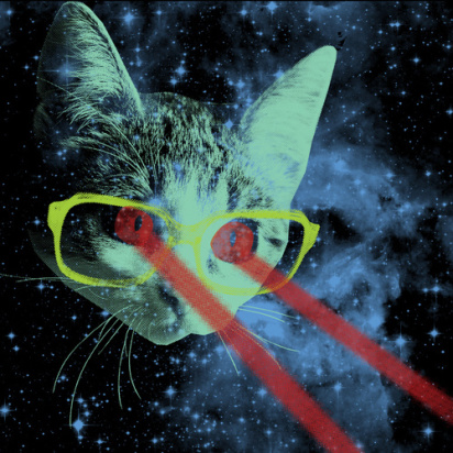
You remember Joe from Thursday, right? Sure you do. He’s awesome. And he’s on the list, if for no other reason than the fact that he named this piece “Mister Mitten’s Big Adventure.” Yes, he spelled out Mister. That, to me, is artist materials, folks.
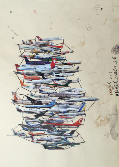
OK, so I broke my rule again. I don’t care; it’s my rule and I can break it, and I can DEFINITELY break it for someone like Craig. Here’s the thing: Someone like Craig doesn’t come along often. Some artists are great artists, but horrid curators. Others are great curators but horrid artists [umm, me?]. Craig is both, and does both equally well, and he gives back to his community. And for that reason, he scored a spot on our finalist countdown.
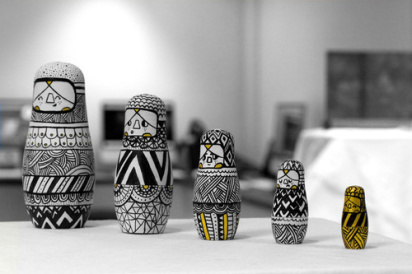
Greg picked up a slot for this piece, another example of incorporating your art into everyday life. I can’t express how important it is for artists to take their talents and infuse it into their lives, and then the lives of others, and others, and others, sort of like how these Russian dolls fit into each other. We do, too, and art makes that better. Wow, am I preaching? I’m preaching. Geez.
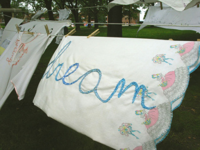
Ha. I broke the rule again. But, I’ve never met Joetta in person, and even though I love her, she doesn’t count as a friend, does she? I don’t even know her middle name. OK here’s the thing. This list was feeling all so masculine, and I needed an artist like Joetta to soften it a bit. And come on— this project? How could I not include this project? So I did. You can’t blame me, can you?
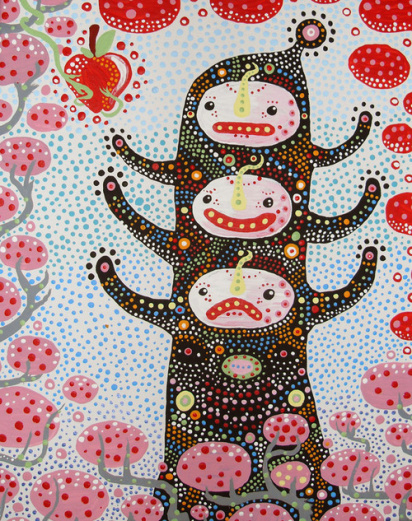
Jacob’s no stranger to us here, and the reason he’s included here is b/c his work is bold and consistent. You can look at a Livengood piece and no it’s a Livengood piece, and that is pretty hard to do (I’m assuming). Plus, it’s awesome, so there’s that.
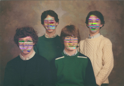
Nicholas seems like someone I’d want to go get a donut with, and that’s why he’s in the list. The piece above is entitled ‘Birthmarks’, and I love the photo in itself, and it’s magnified with these rainbowy bar codes that just make everything into a deeper meaning. Or maybe it’s that it’s cool-looking. Regardless, everything in Nicholas’ portfolio is faaaantastic, and he’s super deserving of a spot on our finalist countdown.
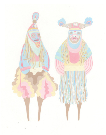
Sophie’s Big Ritual series earned her a spot on the list, because I’ve never seen pastels look so masculine, and her attention to detail is intriguing. I want to look at her pieces for hours, and the use of pattern makes me see something new each time I do.
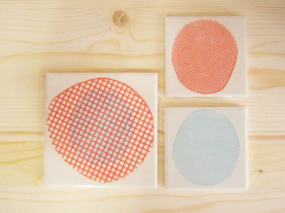
Alana’s a multi-faceted artists, screenprinting anything she can get her hands on, and I’m not going to give the mini-lecture I’ve already given, but again — this is huge for me. If you’re an artist, your job is to make things prettier. Alana’s taking that job seriously, and I love her work for that.
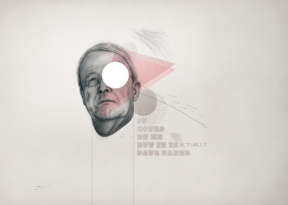
As graphic as it is weird, Oh Yeah’s work speaks for itself. This piece above? In love. In mad, mad love.
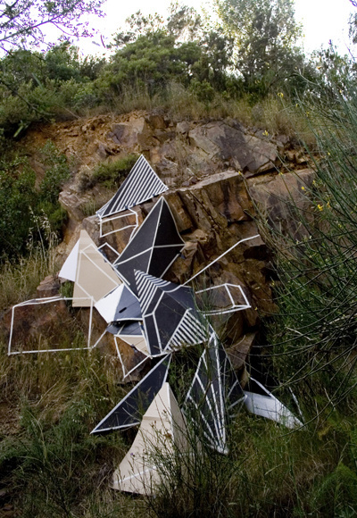
Besides the fact that Clemens has the best name ever, his installations are jaw-dropping. You can’t look at his work and ignore it, and that, to me, is the sign of a top-notch artist. And this piece? Are you kidding me? It’s dripping awesomeness!
Whew. Quite a list, right? This was a harder decision than… well, pretty much all of my decisions are hard b/c I’m indecisive, but one person’s work stood out to me a tiny percentage more than the rest. Perhaps it was subliminal messaging?
Want to know who it was? Check back in ten minutes… ;)


these are really interesting. i’m an illustrator and have a society6 account, but find it very difficult to use– interactions, the layout, everything is all a bit difficult really. maybe it’s just me. do you have any tips on how to make the most out of soc6? i seem to get a lot more contact on plain old flickr in comparison to sites like society6 and coroflot.
:) i’d be interested to hear what you think, erin
maaaan, erin, how did you ever choose!? great selection.
whoa, nice way to make me feel inadequate, erin! i LOVE the work by clemens behr and shannon freshwater, oh, and oh yeah, studio. and greg terry. i’ll stop now. :)
what an amazing collection of artists!! thank you!
i was thinking of doing a grant awhile back and you were way ahead of the game – great spotlight on some amazing work
erin for president
good lord, this was a task! you picked some really wonderful finalists…many i’d never seen before. congrats on pulling this huge project together so successfully :)
hi katie!
good question! this was actually my first stab at a society6 involvement, and i think it’s a super great site for discovering new artists. with that said, you’ve gotta go w/ what works for you. if the easy, minimalist medium of flickr works best for you [i love it, too!], then stick w/ it. social networking should be fun, and when you go overboard and spread yourself too thin, it’s not fun anymore.
so… definitely keep flickr’ing. and if you have some free time and want to navigate a few more waters, society6 and coroflot are excellent examples as well.
aw thanks for the reply erin. yes, youre right, it probably is a case of sticking to what suits you best!