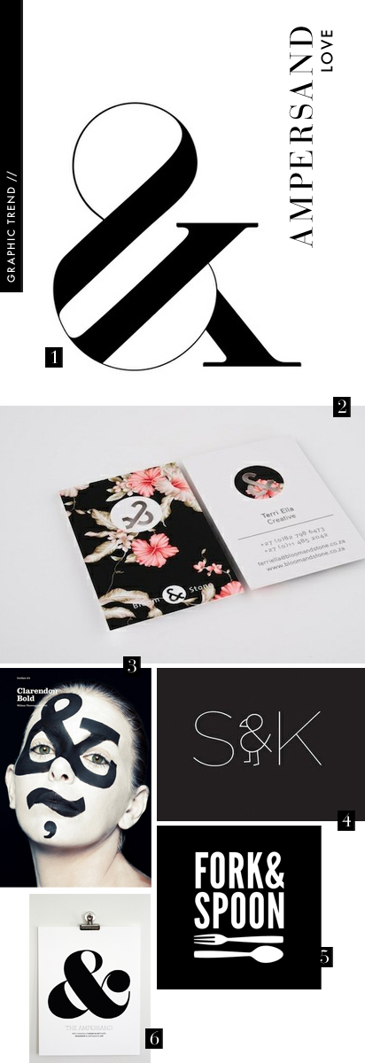
This week’s graphic design trend is honoring one of the typographic kings of the court: the ampersand!:
1. Trendland
2. Bloom & Stone
3. Atipo
4. Kyle Poff
5. Buzzbomb Creative
6. Ampersand Design Studio (of course!)


This week’s graphic design trend is honoring one of the typographic kings of the court: the ampersand!:
1. Trendland
2. Bloom & Stone
3. Atipo
4. Kyle Poff
5. Buzzbomb Creative
6. Ampersand Design Studio (of course!)
Comments are closed.
I’m secretly in love with the ampersand and think it makes a great graphic device! I use it a lot in my work so really appreciated this weeks trend. Thanks!
Also loving the Bloom & Stone identity, just been having a look at it. Fab colours and pattern. Might have to share that myself :-)
True story: I once dated a man who had an ampersand tattooed on his hand. Also, he had legally changed his name to poopy lickles. Don’t ask me what I was thinking.
Ooh my favorite punctuation. Semi-colon next?
~Stop Me if You’ve Heard This One
my initials are “SK”…love that fun graphic!
~sara
http://www.myfantasticdistractions.blogspot.com/
thanks so much for the feature! we’re honored to share the ampersand love with all of these other beautiful pieces!
I don’t know why, but I adore ampersands. These images are great, and have just helped make a decision about a DIY project I’m about to do. So thanks :-)
&chloe (andchloe.com) … obviously I love &!!!
That painted face is insanely cool! Oh how I love ampersands.
Typographic King indeed. WOWZERS!!