Friends! Today’s an exciting day, because we have a new contributor joining us! (Speaking of which, I was overwhelmed by your emails this week – over 250 of them! You’re all so talented, and I so appreciate your willingness to help keep this site afloat while I prep for baby and beyond!). Anyway, please meet Kelsey, who will be joining us every other Friday showcasing the best, most interesting typography on the web today. I’ll let her take it from here!
—
Why, hello! I’m so excited to be with you today as Erin’s new contributor (!!!). My name is Kelsey and I’m a graphic designer, blogger at Pinegate Road, and all around type-nerd. As type plays a major role in my life as a graphic designer, I thought I’d give you a column that would really delve into this wonderful world that I’ve now found myself swimming in for the past six-or-so years.
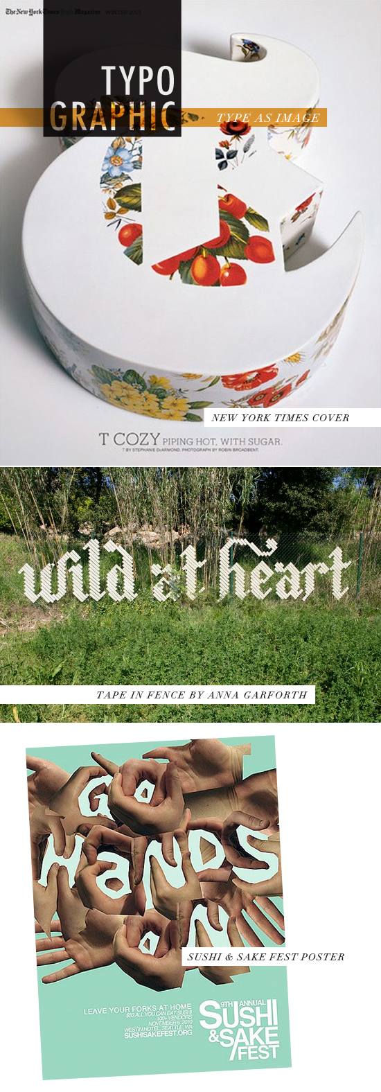
One of the first things you learn as a graphic designer is how to play with type and image. We look between their relationships and try to make those ‘ah-ha’ moments happen. Now something really special takes place when you start to not only play with type and image together, but create type as image. When you transcend into this realm of typography, you know you’re hitting the sweet spot and it’s where–I at least–start to have the most fun. Get out there and start playing with your food, some paper, or even at the beach. It’s all about exploring when it comes to typography.
LINKS: TIMES COVER / TAPED FENCE / SUSHI POSTER


LOVE it! Great new column, so relevant. NYTIimes Magazine is always doing great things on their cover. :) Excited to see where this column goes.
Welcome Kelsey! Great first post!
Oh I LOVE this idea! Great job!
thanks friends – kelsey’s doing a great job already! so happy to have her!
Welcome Kelsey! Gorgeous first post!
love these images, especially the tape on the fence. very neat idea!
Thank you everyone, I’m so glad to be here, and to bring some type-love over to DFM!
That hand poster is amazing! What a great new column. Welcome Kelsey!
Ronnie xo
isn’t she great? :)