

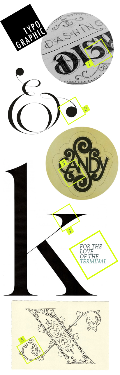
When you start working with typography on a daily basis, it begins to become normal to swoon over pieces of type (yeah, it just got a little weird over here…). This week I’d like to call attention to the terminal — the end point for a stroke on a letterform. These are all examples of how paying attention to a terminal’s detail really makes the design something special.
i completely agree! i’m slowly learning more about typography and it is SO very intriguing.
I am a total typo geek :) love the ampersand
I love it when other people are type nerds just like me! There is way more to a letter than just a simple shape….
Thanks for the fun post, I’m loving that K!
Gotta love the terminal.