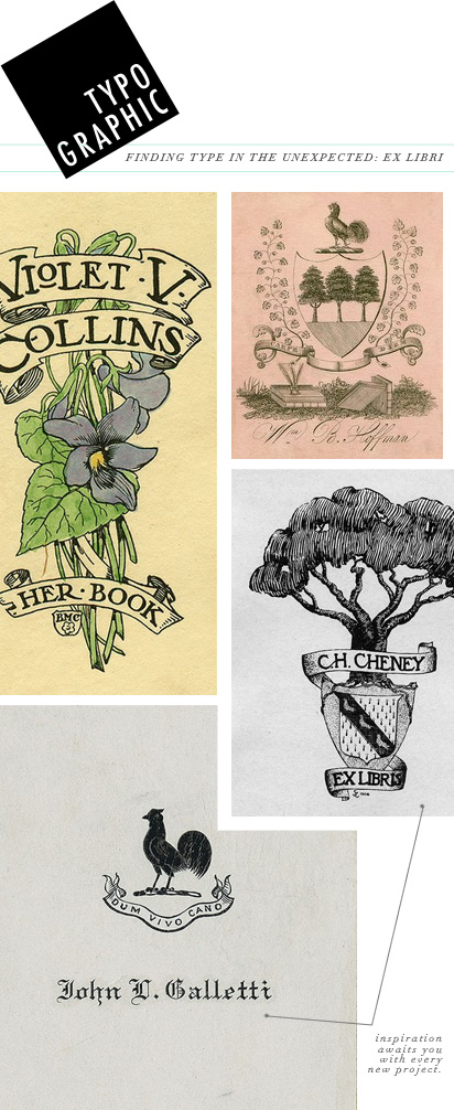
It’s always amazing to be how inspiration strikes, especially when you’d least expect it. Last summer I was working on a branding project and my team and I researched the term ex libris. What is an ex libri you ask? Yeah, I had no clue when we first started out research. It’s a stamp or hand-drawn element that was placed into book that denotes ownership. Back when books were sparse, people delicately created their personalization for their books. After delving into this research we found so many amazing inspirations for typography. I’ve continually looked to ex libri for calligraphy and ornate typography inspiration thanks to this project…
See the moodboard that we put together for this project: Ex Libris. There you can find the links to sources and many other typographic inspirations.
Do you have any stories of unexpected inspirations? I’d love to hear about them!


i love these book plates… so detailed and beautiful. i love looking at old packaging for typographic inspiration. somwhat hard to find these days, but every once in a while i’ll come across an old cookie tin or cigar box at a flea market or thrift store.
aren’t book plates so rad? :)
i own books that have it. each one its made as a representation of owner, real C.G.jung.ish for me!